Our solution to handle multiple screen sizes in Android - Part one
Developing games for multiple devices is not an easy task. Given the variety of devices, one of the most common problem is having to handle multiple screen sizes, which means different resolutions and aspect ratios.
In this blog post we want to share what we did to minimize this problem when making Ironhide’s Clash of the Olympians for Android.
In the next sections we are going to show some common ways of handling the multiple screens problem and then our way.
Stretching the content
One common approach when developing a game is making the game for a fixed resolution, for example, making the game for 800x480.
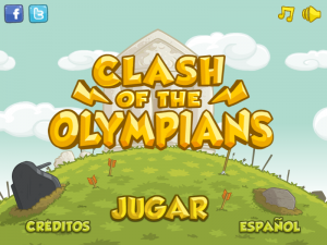
Based on that, you can have the next layout in one of your game’s screens:

Main screen of Clash of the Olympians in a 800x480 device.
Then, to support other screen sizes the idea is to stretch the content to the other device screen:

Main screen on a 800x600 device, stretched from 800x480.
The main problem is that the aspect ratio is affected and that is visually unacceptable.
Stretching + keeping aspect ratio
To solve part of the previous problem, one common technique is stretching but keeping the correct aspect ratio by adding dead space to the borders of the screen so the real game area aspect ratio is the same on different devices. For example:

Main screen in a 800x600 device with borders.

Main screen in a 854x480 device with borders.
This is an easy way to attack this multiple screen size problem, you can even create some nice borders instead of the black borders shown in the previous image to improve how it looks.
However, in some cases this is not acceptable either since it doesn’t look so good or it feels like the game wasn’t made for that device.
Our solution: Using a Virtual Viewport
Our approach consists in adapting what is shown in the game screen area to the device screen size.
First, we define a range of aspect ratios we want to support, for example, in the case of clash we defined 4:3 (800x600) and 16:9 (854x480) as our border case aspect ratios, so all aspect ratios in the middle of those two should be supported.
Given those two aspect ratios, we defined our maximum area as 854x600 and our minimum area as 800x480 (the union and intersection between 800x600 and 854x480, respecively). The idea is to cover the maximum area with stuff, but the important stuff (buttons, information, etc) should be always included in the minimum area.
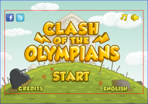
The red rectangle shows the minimum area while the blue rectangle shows the maximum area.
Then, given a device resolution we calculate an area that matches the device aspect ratio and is included in the virtual area. For example, given a device with a resolution of 816x544 (4:3), this is what is shown:

The green rectangle shows the matching area for 816x544.
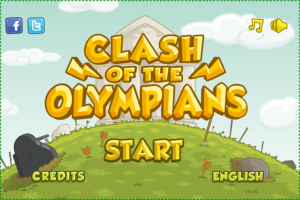
This is how the main screen is shown in a 816x544 device.
In case we are on a bigger or lower resolution than the maximum or minimum area we defined, respectively, for example a screen of 480x320 (3:2), what we do is calculate the aspect ratio and find a corresponding match for that aspect ratio in the area we defined. In the case of the example, one match could be 800x534 since it is 3:2 aspect ratio and it is inside our virtual area. Then we scale down to fit the screen.
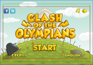
The green rectangle shows the calculated area for a resolution of 800x534 (matching the aspect of the 480x320 device).
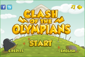
This is what is shown of the main screen in a 480x320 device (click to enlarge the image).
Floating elements
For some elements of the game, such as buttons, maintaining their fixed world position for different screen sizes doesn’t look good, so what we do is making them floating elements. That means they are always at the same screen position, the next images shows an example with the main screen buttons:

Main screen's buttons distribution for a 854x480 device.
Main screen's buttons distribution for a 800x600 device. As you can see, buttons are relocated to match the screen size.
Finally, we want to show a video of this multiple screen sizes auto adjustment in real time:
Adjusting the game to the screen size in real time.
Some limitations
As we are scaling up/down in some cases to match the corresponding screen, some devices could perceive some blur since we are using linear filtering and the final position of the elements after the camera transformations could be not integer positions. This problem is minimized with better density devices and assets.
Layouts could change between different devices, for example, the layout for a phone could be different to the layout of a tablet device.
Text is a special case, when rendering text just downscaling it is not a correct solution since it could be not readable. You may have to re-layout text for lower resolution devices to show it bigger and readable.
Conclusion
If you design your game screens follow this approach, it is not so hard to support multiple screen sizes in an acceptable way. However there is still a lot of detail to take care of, like the problems we talked in the previous section.
In the next part of this blog post we will show some code based on LibGDX for those interested in how we implemented all this.
Thanks for reading and hope you liked it.
